|
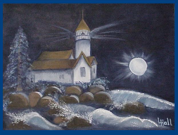
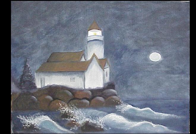
- This one began with free hand drawing the lighthouse onto the canvas. I decided to do a different coastal ending besides rocks all the way down on either the right or left hand side.
- Then I began the backdrop with a mixture of Blue and Payne's Grey. I covered the entire canvas, both top and bottom with that mixture, except where the rocks would go.
- Another week, I added the lighthouse with a mixture of white and a tiny bit of payne's grey. The lightest side has the least amount of Payne's grey added. The darker sides have more.
- The roof is done in burnt sienna with payne's grey added for darkening and shading.
- I began the rocks using payne's grey and burnt umber and burnt sierra. The moonbeams on the rocks is a mixture of white and the blue of the sky. The shading between the rocks is done in payne's grey.
- The waves were placed with ____ blue with upward strokes and curled down with some white mixed in the blue nda the base dark bule. the wave splishes/splashes were originally laid in with a sponge- dipped in turp and squeezed out- and then dipped in the white/light blue color and dabbed on.
|
| session #3 |
The shading for the roofline is done in the mixture of payne's grey and blue. the base for the pine tree is done in this same mixture. Shadows around the lighthouse are done in a blue/ alizerne red mixture.

|
| session #4 |
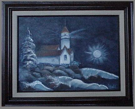
Session #4
First I added another coat of payne's grey and blue mixed together all over the painting in both the sky and on the water below.
Second, I covered over fartherest wave on the right and lowered it in the sky/water level, though I made it bigger in size.
Third, I covered over the moon and lowered it in the sky, reshadowed it, and I began the moonbeams.
Fourth, I covered over the tree and roughed in a 'new' one.
Finally, I blue washed the nearest side of the lighthouse with blue and turpentine, lightly. This added to the shawdowy effect of the scene.
|